One Room Challenge: Week 3

So we’ve had a crazy week at our house. Started last weekend on Cape Cod, spent much of the week with friends in RI- and hosted Easter today. AND I missed this week’s official link up to the One Room Challenge page. Possibly it’s just as well as I actually made zero headway on our kitchen - though I did at least get some yard work done and some spring flowers planted. And we spent lots of QT with family and with friends and had an overall super spring break (aside from the lack of progress at home). Here’s one corner of the kitchen as it stands today. (And yes, I hosted Easter with that cabinet situation. Eek!) Hoping to get things moving and back on track with the One Room Challenge this week-wish me luck!

Still messy. Still not entirely finished with this corner. Hmph.

Still messy. Still not entirely finished with this corner. Hmph.
ORC-Guest-400white.jpg

One Room Challenge: Week 2

Week one is over and I have an update. Not a monumental one, but we’ve made some headway nonetheless. Early last week, we had a carpenter out to discuss building an island in our kitchen.

If you saw the pictures from last week, you’ll notice that previous owners of our house used the kitchen as an eat-in kitchen and had a table and chairs in the middle of the room. There’s room for it for sure. But- the dining room table is just feet away and we don’t need two full dining spaces so close together. What we DO need, however, is prep space. And storage space. AND it would be GREAT if we could move the garbage from the corner of the room where it constantly gets bumped into the wall and takes off the paint. I texted our carpenter this sketch of what I’m thinking:

My sketch for our potential kitchen island

My sketch for our potential kitchen island

When our carpenter was over, he told me about an island he’d built for our friend and I invited myself over to see it. He also mentioned her countertop, fabricated from reclaimed wood by a sawmill on the Cape. I’d planned on using the same surface for the island as we’ll use for the counters (quartz) but her island (see below) was so beautiful that I’m reconsidering and looking into a wood top. No decisions yet but hopefully soon!

booth hill island.jpg

As I’ve given it more thought, I think we’ll replace the microwave opening and drawer with three drawers for more storage. We don’t have a microwave now and honestly, I don’t miss having one. There’s a little corner where we moved our coffeepot that could fit a microwave, but we’ll get more use from a coffee corner and I don’t want to give up storage or prep space elsewhere. At first, I thought we’d leave an opening for a microwave for the next person to love our house thinking that most non-pilgrims would expect one. But we aren’t sure how long we’ll stay in the house and I’d rather design to meet our current needs than someone else’s hypothetical ones.

The island will have three stools on one side and a garbage/recycling pullout, double doors with pull-out shelves, and three drawers on the other. I also pulled together a Pinterest board of island styles I like- Shaker cabinets, relatively modern and pretty no-frills, hopefully something to go with the style of our existing painted cabinets.

Island with seating. (Don't have the image credit as this is a screen shot from Pinterest)

Island with seating. (Don't have the image credit as this is a screen shot from Pinterest)

Another island with seating in a similar style. (A Pinterest find as well, so if I track down image credit, I’ll update my site accordingly)

Another island with seating in a similar style. (A Pinterest find as well, so if I track down image credit, I’ll update my site accordingly)

Here’s the third image I sent to give him an idea of what I’m thinking (ditto for image credit on this one)

Here’s the third image I sent to give him an idea of what I’m thinking (ditto for image credit on this one)

When designing permanent fixtures or considering kitchen design, it’s important to think about the style of the piece (does it play well with the rest of the space or will it stick out like a sore thumb?) but also the function. At our house, T and I both love to cook and we don’t have nearly enough prep space in the kitchen. We also entertain far more than any sane people with kids under six, so we also need room for larger serving platters and bowls. We have a large mixer and blender that are always out since we have nowhere to store them and I’d love to clear room for valuable prep space. Fingers crossed that an island will be the perfect solution for us! Here’s a pic of the kitchen with the island space taped off.

Progress shot of the kitchen

Progress shot of the kitchen

Notice anything new on the left side of the picture? We also got our new dishwasher installed earlier this week

out with the old..

out with the old..

And in with the new!

And in with the new!

It’s from the Frigidaire Professional line and in addition to being fingerprint-free, it is CRAZY quiet. So quiet that we can’t even tell it’s on. The rest of the progress this week was minimal. I think I’ve finally settled on cabinet knobs and pulls after going through approximately one million different options at all of the price points. Initially, I’d settled on knobs in a golden champagne. While the color worked, the mushroom style just felt too starkly modern for these cabinets. Last week, I took a poll on Instagram and the overwhelming winner were these knobs in an ‘antique brass’.

Amerock Allison knobs

Amerock Allison knobs

I found the knobs at a local hardware store and they’re SUPER reasonable and feel pretty sturdy. I like the simple style and the antiqued brass look but I can’t find pulls I like in the same finish from the same manufacturer. The other option was the same style in polished nickel (though I could only find one knob in polished nickel to use as a sample and it’s in a different style):

Amerock knobs in polished nickel. These cost about $6 more/knob than the brass knob y’all preferred

Amerock knobs in polished nickel. These cost about $6 more/knob than the brass knob y’all preferred

Right now, I think my plan is unlacquered brass knobs in the same style and unlacquered brass cup pulls to go with them. REALLY wanted bar pulls for the drawers but just can’t find any I love. Unlacquered brass will be shiny in the beginning, but I absolutely love the patina it takes on as it ages and it’s the look I’m really most excited about. Here’s the stove with no knobs, followed by the kitchen we started with earlier this winter to refresh your memory.

Fingers crossed by this time next week, I’ll have all of the doors back on and hopefully knobs. And maybe I’ll have the island and countertops officially on order. If you haven’t already, be sure to check out some of the progress the other One Room Challenge participants have made this week over on the ORC’s blog. Lots of people have had an incredibly productive week!

stove.jpg
The decorative piece above the sink is down and I am SO happy about it!

The decorative piece above the sink is down and I am SO happy about it!

ORC-Guest-400white.jpg

One Room Challenge- The Kitchen

ORC-Guest-400white.jpg

Since moving in nearly five years ago, we’ve slowly updated many of the spaces in our house to bring our little ranch into the 21st century. The one glaring sore spot has been our kitchen. When we bought the house, it looked like this.

cdrwd kitchen old.jpg

Grim, right? So we made a few, relatively easy fixes when we moved in.

kitchen from basement wall.JPG

That brick soaked up SO much paint but beyond happy we tackled that early on. Walls (which I JUST changed) are SW Sea Salt and bricks are another SW color- something Pearl. I’ll have to look it up. Here’s a view as you walk into the kitchen

kitchen from front hall.JPG

This was taken after I updated the cabinet knobs and pulls (they’d previously been wooden with inlaid brass flowers). AND after we were forced to update our range when our old one started heating up even when the oven was turned off. So it’s much improved from what it once was. But still. Very, very sad.

Enter the One Room Challenge. Created by designer Linda Weinstein and sponsored by numerous home decor purveyors and by Better Homes & Gardens, it’s a 6 week challenge for designers (and guest designers like me) to tackle and complete a room or a project. I participated in the fall to motivate myself to finish our master bedroom which I’d been dragging my feet on for actual years. It worked- well, almost. I still need to either find or paint something to hang over our bed- but that’s a post for another day.

Past One Room Challenge designers have created some amazing spaces and I’m excited to follow along on their blog to see what they create this season. As for me, I have big plans for our space.

Ktichen Option 1.jpg

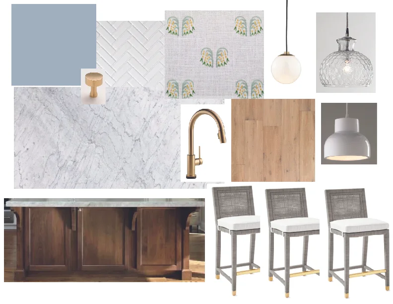
I’m using the above space I mocked up in the fall as a very loose inspiration for what the kitchen will become. We started painting the cabinets about two months ago since I had a feeling it might take us FOREVER. (It has). I’ve gotten about a million hardware samples and have ALMOST made up my mind about which way to go. So I need to get those ordered and installed. Also, I very aggressively ordered soft close drawer slides to replace our old slides but am having a devil of a time getting them installed. I can get them in, but the closing is anything but soft. That’s on my agenda for this week. As is painting the kitchen ceiling and ordering countertops. Visited the MS International warehouse in Norwood and these two quartzes are the frontrunners:

MSI Calacatta Verona Too veiny? Just right?

MSI Calacatta Verona Too veiny? Just right?

MSI Calacutta Clara (excuse the bad lighting) Too blah? Subtly perfect?

MSI Calacutta Clara (excuse the bad lighting) Too blah? Subtly perfect?

So wish me luck! Wish US luck, really- since this is definitely a team effort/scramble! Excited to officially kick things off!